

Designing a suite of apps that rewards good habits with crypto
Most people know what they should do. They should sleep more, stress less, take care of the living things around them. The problem has never been knowledge - it's follow-through. This case study explores how we designed a suite of three apps that close the loop between intention and action, using real crypto rewards to make the right behaviour the obvious one. Built in 12 weeks, with no lengthy research, and a strong conviction that good design can make good habits feel inevitable.


My Role
Lead Designer
Timeline
12 Weeks
Platform
Web3
Constraints & Considerations
-
⏳ Time : 12 weeks. Three apps. One designer. No room for slow decisions, lengthy research phases, or backtracking.
-
💰 Crypto-naive users : The target user is not crypto-native. They shouldn't need to understand wallets, gas fees, or token mechanics to earn and collect. The crypto layer had to be invisible or simple.
-
🤖 Responsible AI framing : An AI chat for mental wellness required clear, honest scope-setting. No diagnostic claims. No medication language.
-
🍏 Third-party dependency : The apps would be heavily dependent on Apple Health API so features need to be planned accordingly.
A Brief Look at What We Built
Each app rewards a different healthy habit with $B3TR Coins- a sustainability focused token

PillowPoints rewards users for maintaining a good sleeping habit every night.
Gurufi rewards users for doing focused relaxation, meditation or breathing exercises everyday.
PlantPerks rewards users for watering their plants everyday. Rewards multiply if user maintains streaks.
Early Decisions
The calls we made
before we designed anything
process
Build all three apps simultaneously, not four weeks each
why
The three apps share a token, a reward mechanic, a collect flow, an earnings history pattern, and a profile structure. Designing Sleep first would have meant making decisions about those shared components in isolation — decisions we'd have had to unpick or duplicate for Mind and Green. Doing it simultaneously meant shared components got designed right once. The depth staggered as the weeks progressed (Sleep went deep first, as the simplest system), but the parallel thinking stayed throughout.
authentication
Use Privy - so users never have to think about wallets
why
The target user has never opened MetaMask. Asking them to set up a crypto wallet before they earn their first token would lose most of them at the door. Privy solved this: users sign up with email or phone number, and a wallet is created automatically in the background. They never see it until they're ready - and even then, "Collect" feels like claiming a reward, not executing a blockchain transaction. Users who already have a wallet can connect it directly. For everyone else, the crypto layer is invisible until it becomes valuable.
design tooling
Use a React Native Figma component library - and build on top of it
why
12 weeks across three apps left no room to build UI components from scratch. The decision was to start with a React Native component library in Figma for the majority of standard UI - inputs, buttons, cards, modals - and extend it where the apps needed something specific. This gave the design a consistent, shippable foundation without burning weeks on components that already existed. The custom work went into the things that actually differentiated the apps.
The Process
All three apps simultaneously, not four weeks each. The shared token logic, reward mechanics, and component system needed to be designed once. Building sequentially would have created conflicts that cost more time to unpick than the parallel complexity cost to manage.
No surveys. No interviews. No three-week discovery.
week
1
ALL THREE APPS IN PARALLEL
Scoping the ecosystem
Three apps mapped simultaneously over a series of calls with all the stakeholders. Defined the shared token logic, what data each app reads, which components would be shared across all three, and what would be app-specifics. Privy chosen for auth. React Native component library selected. The three early decisions were locked here, before a single wireframe was drawn.
week
2
REFERENCE AND DIRECTION
visual direction LOCKED
Looked at StepN, Finch, Calm, PictureThis, and WHOOP. Built a Notion moodboard. Made one clear call: this isn't a crypto app that happens to care about wellness. It's a wellness app that happens to use crypto. That inversion drove the entire visual direction - warm, grounded, human. Each app gets its own brand kit complete with logo, colors and typography.
week
3-4
HEALTHKIT SCOPE + WIREFRAMES
Reality check
Scoped exactly what Apple Health exposes. Sleep stages ✓. Mindfulness minutes from third-party apps ✓. Plant watering - not a HealthKit thing, so PlantPerks became a camera and AI approval flow instead. Wireframed all three home screens and the earnings views. Sleep goes deepest first - the simplest system, setting the pattern the other two would follow.
week
5-9
High-fidelity UI · AI AS THOUGHT PARTNER
DESIGN WORK STARTED
Bulk of the time went into design time, reviews and feedback cycles. Built on the React Native component library with custom work on the differentiating elements such as sleep stage visualizations, AI chat, calendar interface and many more. AI was used throughout to pressure-test decisions, surface edge cases, and generate copy as a constant thinking tool whenever a decision needed a second opinion.
week
10-11
Additional feedbacks
FINAL STAGEs
Final feedback rounds incorporated. GuruFi required a more careful writing. Legal gave one clear line: no diagnostic language, no medication references. Designed clear, honest disclaimers about what the AI chat is and isn't. It gives breathing exercises and grounding practices - it does not diagnose, prescribe, or replace a therapist. Empty states, error states and onboarding flows added.
week
12
HANDOFF
THE FINALE
Figma files cleaned, components documented, Flows prepared for dev. App Store screenshots designed for all three apps.
Anti-Gaming Considerations
"Leave the phone in bed all night" , "Loop a meditation track all day" , "Find a plant photo online. Submit it."
Protecting the ecosystem from automated or dishonest activity
HealthKit uses accelerometer + heart rateto detect actual sleep - not just time stamps. Lying still doesn't count.
PlantPerks
A minimum asleep-to-in-bed ratio is enforced. Long time in bed with no sleep stages detected doesn't qualify.
Manual HealthKit edits are flagged by Apple's own data provenance system. We inherit that check.
The AI chat requires active typing - naturally hard to automate. Chat minutes are earned through real engagement.
GuruFi
The low threshold (10 minutes) is itself a design choice - the reward for cheating is small, and the habit of doing it honestly is worth more.
A 60-minute daily earn cap removes any incentive to run the app all day. The AI chat reminds about this cap when hit but still continues the session. Transparent, not punitive.
AI image review checks EXIF timestamp, plant type and existence of a human hand
PlantPerks
Duplicate image detection- the same photo can't be submitted twice, even across accounts.
Final Designs
Where It All Comes Together
APP #1 : PillowPoints
What does the PillowPoints do?
Most people know they're not sleeping enough. They just don't have a reason compelling enough to actually go to bed on time. PillowPoints makes the case financial. The app reads your sleep data from Apple Health, shows you the full picture of your night, and rewards the behaviour without requiring you to do anything differently except actually sleep.
What should be the reward threshold ?
WHO and CDC adult sleep guidelines both land at 7–9 hours. We set the floor at 6.5 achievable for most, but not something you accidentally hit. Low enough to form a habit, high enough to have health value. No grace buffer.


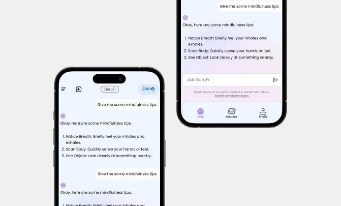
APP #2 : GURUFI
What does the GuruFi do?
The barrier to mindfulness isn't not knowing it helps - it's that on the days you need it most, opening a meditation app feels like the hardest thing in the world. GuruFi meets you where you are: use any app you already have, and earn for the time you log. Or skip the app entirely and just talk to the built-in AI - it'll walk you through a breathing exercise, and that time counts too.
What should be the reward threshold ?
10 minutes. Easy to hit on a good day. Designed to still be reachable on a bad one. AI chat minutes count toward the total.


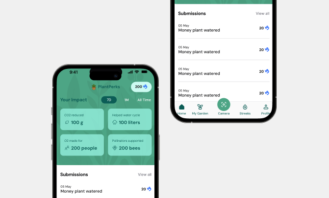
APP #3 : PLANTPERKS
What does the PlantPerks do?
Most people who own plants are, at some level, failing them. PlantPerks turns plant care into a habit worth keeping - photograph your watered plant, upload it, earn if it's approved. Over time, streaks multiply your rewards. The home screen shows something most plant apps never bother to tell you: the actual environmental impact of what you're doing. The CO₂ your plants absorb. The pollinators they support. The O₂ they produce. Turns out keeping your monstera alive is doing more than you thought.
What should be the reward threshold ?
10 minutes. Easy to hit on a good day. Designed to still be reachable on a bad one. AI chat minutes count toward the total.


What building three apps in 12 weeks taught me
TAKEAWAYS
Utility Beyond Tokens
The token is not the product. It's the nudge. We spent a lot of time making sure the apps would be worth using even if it had no monetary value because the moment the token dips, the only thing keeping users is genuine habit value.
Systemic Efficiency
The component library decision paid off in ways that weren't obvious until the feedback cycles started. When a stakeholder wants a layout changed across all three apps, having a shared component system means you change it once.
DecisiON SPEED
Speed forces honesty. When you can't research and over-iterate, you have to trust your instincts and be clear about what you don't know. The things we were least certain about - we said so. The things we were confident about - we moved on.
Behavior vs. Task
Designing for behaviour change is harder than designing for task completion. These apps succeed only when someone actually performs the tasks three weeks from now. The UX has to carry motivational weight that most apps never have to think about.
Frictionless Onboarding
The design balances the security needs of crypto-natives with the simplicity required by the majority. This approach ensures the wallet and token serve as intuitive nudges for better habits without creating a technical barrier to entry.
INVISIBLE ANTI GAMING
When the reward is real crypto, the incentive to cheat is real too. Anti-gaming should be invisible to honest users and only surface when triggered. We didn't want the app to feel like it was watching anyone - just quietly fair.
