

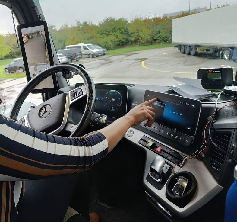
Driver’s digital cockpit: Redesigning Daimler Trucks' infotainment
With evolving tech, new electric variants, and rising expectations, Daimler Trucks needed a cockpit experience that felt both powerful and effortless. This case study explores how we designed the Multimedia Cockpit Interactive 2.0 to deliver smarter interactions, safer controls, and a UI that catches up to the way trucks are driven today.


My Role
UX Designer
Timeline
10 Months
Region
Europe & USA
GOALS OF THE REDESIGN
-
Address drivers' painpoints with the current HMI
-
Bridge the competitive gap with an intuitive, market-leading HMI
-
Support new electric models (e.g. eActros) with EV-specific data
-
Optimize the organization and management of design assets
Constraints & Considerations
-
⛑️ Safety First : The displays must to be distraction-free, neither too obtrusive nor too discreet. In-vehicle tasks should be completable within 12 seconds of total glance time.
-
💺 Ergonomics & Visibility : The design needed to account for varying driver postures and cabin lighting-ensuring controls remained within comfortable reach and screens were easy to read without strain, day or night.
-
🇺🇸🇪🇺 Regional variants : USA and Europe have different regulations and feature sets, so the HMI had to support both with modular options.
-
📂 Regulatory compliance : The UI must meet stringent road-safety and infotainment guidelines (ISO 26262, NHTSA Guidelines and Android Auto/CarPlay certification rules).
-
🌎 Globalization : The system must support 40+ languages without altering layout.
Peak into our Legacy HMI
Multimedia Cockpit 1.0 - World's First Fully Digital Cockpit in a Series-Production Truck


MC 1.0 redefined the heavy-duty trucking UX by replacing fragmented analog controls with a unified, driver-centric digital ecosystem that brought passenger-car sophistication to the long-haul environment.
However, as the industry pivots toward autonomous assistance and hyper-connectivity, the transition to MC 2.0 reflects a necessary evolution to a more fluid, high-performance "Interactive" experience.
Research & Discovery
An objective evaluation of user behaviors and market requirements
1. Truck clinics: Drivers from varied backgrounds and driving different truck brands were invited for a one day of workshops to gain qualitative insights into their daily routines, specific challenges encountered with the current HMI, and their aspirations for an ideal interactive system.
2. Competitor Benchmarking: A thorough review of HMIs in competitor trucks and other advanced vehicle types was conducted. This analysis helped identify industry best practices, emerging trends, and opportunities for innovation.
3.Heuristic Evaluation: A thorough evaluation of the legacy HMI, was conducted to identify usability issues and areas for improvement.
4.Ride-alongs: Drivers were observed in their natural environment to identify real-time interaction patterns, understand the influence of environmental factors (e.g., vibrations, light conditions).
5.Simulations: To evaluate user behavior in high-risk or controlled scenarios, we utilized high-fidelity simulation environments. These setups allowed us to replicate complex environmental variables and emergency road conditions-such as extreme weather or sudden obstacle avoidance-that would be unsafe or impossible to test during a standard drive.


📍Internationale Automobil Ausstellung, Hannovar: Where we conducted competitor benchmarking of emerging and legacy OEMs
Heuristic Evaluatioin in progress


A Mercedes V Class converted for VR simulations
Testing what drivers' would see during a VR exercise
Triple-screen panoramic display


Ride alongs on race track and live roads
Key Insights
What we Found out...
63%
Consider digital cockpit very important for truck purchase
41%
Cite fragmented systems as biggest barrier to digital service adoption
50%
Slower reaction time observed when using Android auto and CarPlay
These numbers set up a core tension: drivers and fleet managers increasingly value digital cockpits, yet the current execution introduces safety risks, cognitive overload, and fragmented experiences that work against them.
THE "FRAMING HAND" COPING STRATEGY
When using the secondary display, drivers lean their hand on the screen edge to create a "frame" giving them a better grip to use the screen comfortably and with better precision.
TOUCHSCREEN USE SPIKES WHEN STOPPED, NOT WHILE DRIVING
When stopped, drivers prefer touchscreens. While driving, they gravitate toward steering wheel controls. But gaps in SW control coverage force touchscreen use at unsafe moments.

hand position while interacting
Design Process
The art of connecting dots that haven't been drawn yet
The design process wasn’t linear-it was iterative and evolving. We moved back and forth between ideas, prototypes, and feedback, constantly refining based on technical constraints and real user input.
Stakeholder
Alignment
We collaborated with product managers and engineering teams to align on technical feasibility and understand the workings of each feature thoroughly
Ideation
& Wireframing
We explored a wide range of layout directions, interaction patterns, and navigation structures. Over several weeks, we created 100s of low-fidelity concepts across 20+ feature
User Flows & Steering Control Mapping
We designed detailed user flows, including edge cases. We specifically planned how the multifunction steering controls would navigate each screen consistently
Prototyping & User Feedback
We created quick, iterative prototypes to gather rapid feedback and make continuous improvements. Drivers tested these concepts on simulators, allowing us to validate ideas early
UI & Text
DoCUMENTATIONS
Once concepts stabilized, we defined developer handoff specs- use case IDs, Screen IDs, Component IDs etc. Text codes were catalogued for dynamic translation
Finalization & Quality Assurance
We partnered closely with developers during implementation, conducting pixel-perfect reviews and QA to ensure design accuracy, consistency, and a polished final experience
The Designs
Form, Function, and Interaction

comparison of home screen and navigation bar,
Top (before)→ Bottom (after)
QUICKER NAVIGATION
We replaced the homescreen with a 2×4 app grid - visually scannable and one-tap access to every major area.
The navigation bar was pushed to the right edge of the screen, freeing the primary content area. This mirrors the drivers' natural behavior of resting their hands on the screen.
BEFORE ⏮️
Horizontal menu structure. Navbar icons at the corners were not supporting driver interaction behaviors.
AFTER ⏭️
Grid layout - more apps visible at a glance. Navbar pushed right, content area freed. Faster app discovery, fewer glances
STEERING WHEEL CONTROL FIRST APPROACH
We standardised SW button behaviour so that moving around in the secondary screen has a consistent, predictable outcome - focused on creating a muscle memory for the driver.
For the focus movement we introduced a "nearest neighborhood" + "section focus" approach
BEFORE ⏮️
Inconsistent SW button behaviour per function.Unable to manage complex apps without reaching for the touchscreen while moving.
AFTER ⏭️
Uniform, predictable controls across all driving tasks. Creates muscle memory over time and eyes stay on the road.


REFRESHED UI BUT KEEPING THE DNA ALIVE
The interface underwent a strategic visual overhaul aimed at achieving a sleek, premium aesthetic while rigorously preserving the legacy DNA that defines the Daimler driving experience. We ensured that the transition feels like a natural progression rather than a disruptive shift. It closes the gap between what drivers experience in their personal cars and what they step into at work.
We prioritized information hierarchy and component clarity to eliminate cognitive friction. We created a more focused workspace that respects the high-stakes nature of long-haul trucking.
BEFORE ⏮️
While the original UI was effective for the time in which it was engineered, the digital landscape and driver expectations have shifted.
AFTER ⏭️
A streamlined, high-contrast interface that utilizes the same functional controls but presents them through a modernized lens.


comparison of UI changes with the help if Interior Lights
Top (before)→ Bottom (after)
TACHOGRAPH - NOW A DIGITAL EXPERIENCE
Fleet drivers are legally required to track driving and rest time to meet HGV regulations. Previously, this meant relying on separate physical tachograph units.
The new Digital Tachograph screen integrates compliance tracking directly into the infotainment system. Drivers can monitor their driving/rest split in real time, see their historical data and trends and plan their day with richer information.
BEFORE ⏮️
Managed through a standalone physical hardware unit, requiring drivers to monitor logs on a small, isolated peripheral.
AFTER ⏭️
While the physical key card unit remains for authentication, it now seamlessly syncs with the Digital Tachograph interface


BATTERY CHARGING MANAGEMENT
As electric trucks enter the fleet, charging management becomes a routine part of every driver's day.
The new Battery Charging feature brings this entirely in-cabin: set target charge percentage, set charging limits, track energy flow, and configure departure time - all from the cockpit.
BEFORE ⏮️
No electric truck related features
AFTER ⏭️
New Battery charging feature for in-cabin charging management eliminates

NOTIFICATION MANAGEMENT
Classified all alerts into distinct tiers based on urgency and context. A dedicated panel lets drivers review missed alerts when it's safe to do so.
-
Toasts (Low Priority): non-disruptive "pings" for feature-related updates or status changes that do not require immediate driver action.
-
Heads-Up Notifications (Medium Priority): Context-aware overlays for active tasks, such as incoming calls, featuring actionable buttons for rapid, glanceable decision-making.
-
Pop-ups (Critical Priority): High-contrast, modal interruptions reserved for mission-critical vehicle data or safety warnings that demand immediate attention.
BEFORE ⏮️
All notifications treated equally. Led to alert fatigue and important notices being ignored.
AFTER ⏭️
Toast / HUN / Popup tiers based on urgency and context. Dedicated notification panel for safe, deferred review.
AFTER ⏭️
Supports a more natural interaction model that allows drivers to speak more freely without the need for verbatim memorized commands.
BEFORE ⏮️
Relied on rigid command phrases. Drivers had to memorise exact syntax - often frustrating and abandoned mid-task.
SMARTER VOICE RECOGNITION
The voice interaction system has evolved from a rigid, command-based interface into a more intuitive Semantic Keyword Engine. This transition eliminates the need of memorizing exact phrasing, allowing the system to recognize a broader "gallery of words" used interchangeably to trigger vehicle functions.
By mapping flexible synonyms to specific intents, the cockpit now interprets conversational requests—such as "Find a charger" versus "Locate a station"-with far greater accuracy and ease.
HARDWARE~SOFTWARE SYNERGY
This unified interface allows drivers to monitor and calibrate heavy-duty hardware components with precision, ensuring that critical vehicle health and mechanical status are always under effortless control.


Digital twin accurately reflects the physical state of the hardware.

Simplified mechanical adjustments

Each design intervention maps to a measurable or observable outcome - reducing distraction, increasing fluency and elevating the interface through a sheer, sophisticated design language.
What these changes deliver...
Fewer Eyes-Off-Road Moments
Consistent SW controls + predictable button behaviour reduce the need to look down during driving tasks.
Faster
App Discovery
Redesigned homescreen and navbar reduce time-to-function compared to nested menus.
Lower
Cognitive Load
Tiered notifications, unified IA, and smarter voice assistant reduce the mental effort required to interact safely.
The HMI Becomes Self-Sufficient
Features that once required separate devices or external apps now live entirely within the native HMI.
The System
Earns Trust
Predictable controls, tiered alerts, and contextual voice recognition mean drivers stop working around the system and start relying on it.
A Modern Aesthetic with Legacy Roots
The refreshed UI signals to drivers - especially younger ones - that the truck is a modern, professional machine.
Final Thoughts
Redesigning this HMI taught me how small interaction details-like finger placement, button spacing, and feedback timing can deeply influence usability, especially in high-focus environments like a truck cockpit. Balancing digital functionality with physical ergonomics was a recurring challenge, but it reinforced the value of user empathy and real-world context. This process sharpened my eye for clarity, restraint, and intentional design where every touchpoint must earn its place.
While this version captures the intended direction, it’s just a first step. Drivers’ feedback will shape where it goes next. Looking forward to iterating based on how users respond, what works, and what can be made better.

